A good color palette makes a home feel intentional. Not just pretty for a listing photo, but right when you wake up and right when you turn off the lights. I have walked into countless rooms that were well furnished and still felt off. The problem was rarely the furniture. More often, it was undertones fighting each other, sheen bouncing light in odd ways, or a color chosen from a tiny chip without any daylight testing. The fix starts long before you open a paint can.
Start with the room you actually have
Every palette has to answer to the light, the architecture, and the surfaces that cannot move. Morning light is cool, midday light is balanced, and late afternoon sun throws a warm cast that can turn a calm gray into a purple you never planned for. North-facing rooms lean cool throughout the day and need help from warm tones. South-facing rooms take whites toward cream and push beiges warmer. If you are deciding between two whites, take them to the wall against trim, then compare them at three times of day. Look from across the room, because color fields behave differently at a distance.
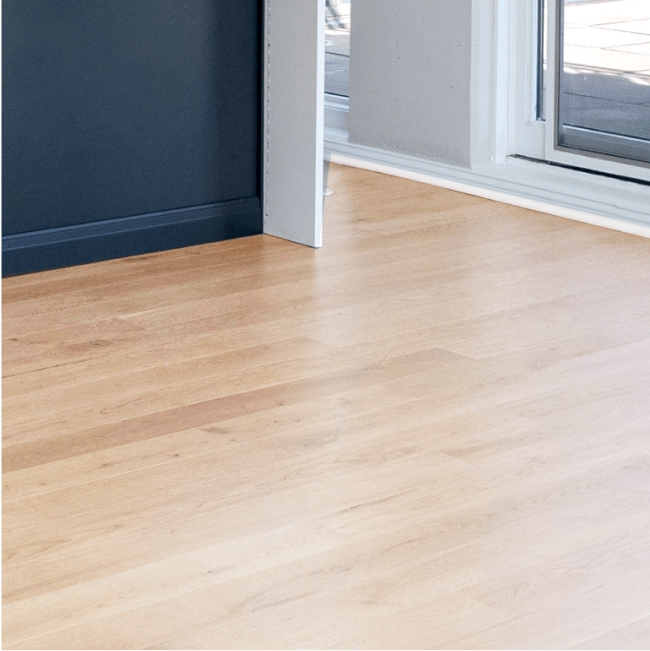
Fixed elements matter just as much. Oak floors with orange undertones pull blues toward teal. Carrera marble in a bathroom holds blue-gray veins, which can make a taupe wall read muddy if the undertone leans red. Kitchens give you the fastest lesson in undertones. Countertops, backsplash, cabinet color, and flooring often come from different vendors and seasons. If your kitchen has cool white quartz with gray veining, a slightly warm white on the cabinets can read dingy next to it. I have seen homeowners choose a fresh wall color only to discover their “crisp white” cabinets look yellow once the painter leaves.
Test like a professional
Color chips and fan decks are roadmaps. Large samples on the wall are the terrain. Roll two coats of your finalists on at least 18 by 24 inch swatches, or use peel and stick samples from a reputable brand. Place one sample near a window, another in a shadowy corner, and one adjacent to trim. If you use incandescent or warm LED bulbs, flip them to 3000K during testing. Color temperature skews perception, and many homes still mix 2700K lamps with daylight bulbs from the big-box store. If your home has a mix, you will want to choose a forgiving palette that does not swing too cold under daylight or too yellow under warm lamps.
Professionals also use a simple trick: tape a strip of bright printer paper next to the sample. The neutral white reveals undertones by contrast. Blues show their green or violet bias, beiges reveal their pink or yellow cast, and whites confess whether they are warm, cool, or neutral. Spend a full day living with samples. A wall color that feels fresh at 10 a.m. can feel icy during a winter evening.
Build a palette from a hierarchy, not from favorites
Start with a base color that covers the largest surface area, normally your wall color for the main living spaces. Pick one that plays well with your flooring and trim, and one you will not tire of over time. Next, choose a trim and ceiling color. They should share a temperature with the walls but not necessarily the exact same white. Many pros default to a tried and true trim white with a touch of warmth and then shift to a flatter, slightly lighter ceiling white to keep the ceiling from feeling heavy.
Then layer in accent colors for smaller rooms and elements. Do not think of accents https://finnjphm304.yousher.com/frameless-vs-framed-shower-doors-what-s-the-difference as “bright” by default. An accent can be the deepest shade on your palette, used sparingly on an office wall or behind bookshelves. Or it can be a subtle shift, like moving two shades deeper in the same color family in a dining room to create a cocoon at night.
A useful rule when you are stuck: choose one dominant neutral, one supporting hue, and one accent. The neutral ties spaces together. The supporting hue appears in upholstery, art, or cabinetry and repeats in a hallway or powder room. The accent carries the personality, often in small doses. You can deviate, but the discipline keeps a house from feeling like a patchwork.
Undertones, sheen, and why almost-right can look wrong
Two colors can share the same name and live on opposite ends of the undertone spectrum. Compare a greige with a green undertone to one with a violet undertone. On a page, both read “greige.” On walls, one looks fresh, the other drab, depending on what is underfoot and what light you have. For bathrooms, watch how cool grays stack against chrome fixtures and white tile. I keep a pocket set of white tile samples because glossy white surfaces shift perception. Manufacturers also adjust formulas over time, so if you are touching up, verify your paint was not reformulated between batches.
Sheen is the quiet partner that can make or break the palette. Flat hides imperfections but scuffs easily. Matte and eggshell get used most for walls because they resist scrubbing without spotlighting every drywall ripple. Semi-gloss on trim is durable and highlights profiles, but if your carpentry has seen better days, a satin sheen forgives more. In stairwells with lots of hand contact, a washable matte or a gentle eggshell on the walls keeps clean-up easy. For ceilings, flat is almost always the way to go. It disappears. If you use a higher sheen on ceilings in a room with raking light, prepare to see every joint.
When color psychology meets floor plans
Color psychology is useful in small doses. Cool blues and greens calm, warm reds and oranges energize, yellows brighten. But the real test is how your floor plan flows. An open plan living, dining, and kitchen area cannot handle four different statements. Pick a single wall color that handles morning and evening, then use variation in wood tones, textiles, and lighting to create zones. If you want a shift, keep it in the same family. For example, a soft gray in the living space with a deeper charcoal on the kitchen island or on the back wall of a built-in. That gives depth without chopping the space.
Bedrooms appreciate hushed tones. You can use deep color successfully, but be mindful of lampshade warmth and curtain lining. A deep blue that relaxes can turn moody if every nightstand lamp skews orange. Bathrooms benefit from light that flats the face. If you are exploring The Best Paint Colors for Bathrooms in 2025, look at warm whites with a hint of peach or pink undertone in the same space as a cooler white on the ceiling. It helps skin tones and still keeps the room crisp.

Neutral families that play nicely together
Neutrals are not boring if chosen with intention. Complex neutrals with mixed undertones adapt across seasons and bulb temperatures. In homes with mixed flooring, such as hardwood in living areas and tile in kitchens and baths, choose a neutral that shares at least one undertone with both surfaces. If your hardwood has red undertones and your kitchen tile runs cool gray, a balanced greige with a quiet red-violet bias can bridge them.
The Best Neutral Paint Colors for Home Resale tend to stay in a tight band of light reflectance, not too bright, not too muddy, roughly between 60 and 75 on the LRV scale for walls. That range brightens rooms without washing them out. For trim, drop to an LRV near 80 to 88, and use a durable enamel for a crisp edge against walls. People underestimate how much a precise cut line elevates even the simplest color.
Kitchens deserve extra care
Kitchens hold more materials than any room. If you have read Kitchen Cabinet Painting vs. Replacement: What's Right for You? you know how much finish and color affect the perceived quality of cabinetry. When you set a palette, prioritize the relationship between wall color, cabinet color, and countertops. A balanced approach works well. If your Thinscape Countertops: A Modern Alternative to Traditional Stone have a cool gray field, pair them with a warm off-white cabinet for contrast, then pick a wall color that splits the difference. If your backsplash is busy, keep the walls quiet and consider a slightly deeper trim to frame the tile.
I like to sample wall color behind a removable panel near the range and near a window. Steam and under-cabinet lighting create conditions that make certain colors go sallow. LED strip lights vary wildly, so if you are planning Kitchen Lighting Design: How to Brighten Your Cooking Space, choose consistent color temperature before finalizing paint. For homes in colder climates with long winters, like Chicago, warm whites and soft greens can keep kitchens from feeling sterile under gray skies. If resale is on your radar, The Best Cabinet Colors for Resale Value in Chicago are often soft whites, greiges, and navy island accents, paired with simple, high LRV walls.
Bathrooms stand or fall on undertones
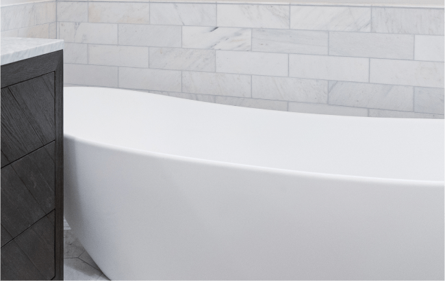
Tile drives bathroom palettes. Marble wants cooler companions, earthy porcelain tile wants warmer ones. If you are studying Bathroom Tile Trends: From Classic to Contemporary, notice how modern patterned tiles often mix warm and cool in the same piece. Sample several whites and lights against the tile and the vanity top at the same time. For master baths, many clients ask for spa-like blues. A blue with too much gray can feel institutional. A blue-green with a modest chroma gives life without shouting. In small spaces, like powder rooms, deep color can be spectacular if you pair it with high contrast trim and strong lighting. Powder Room Design Ideas That Make a Statement often include bold wallpaper; if you are painting instead, you can achieve drama with a rich clay, in a matte finish, and brass hardware to warm it up.
Revive 360 Renovations and the palette walk-through
When we guide clients through color, the first meeting is a walk-through with a portable light meter and a box of large swatches. At Revive 360 Renovations, we start by identifying sight lines. The color you choose for the foyer might be visible from the family room and the kitchen simultaneously. That means the foyer color has to behave with both the living room rug and the kitchen backsplash. We tape samples at shared view points, then step back to the far corner and check the harmony in a single glance.
On a recent project, a family wanted a crisp white throughout but had warm oak floors and a busy, cool-toned granite. Rather than force a single white, we selected a slightly warm off-white for walls and a cleaner, cooler trim enamel. That kept the walls from clashing with the floors while the trim aligned with the granite and stainless appliances. The result felt cohesive without being monotone, and it avoided the common trap of making oak floors look orange against a sterile white.
The overlooked power of ceilings
Most ceilings are painted builder white out of habit. Changing the ceiling color even slightly can reshape the space. Lower ceilings benefit from a white with higher LRV and a tint that matches the wall’s undertone. High ceilings can handle a small drop in LRV, which reduces that cavern feeling. In dining rooms with crown molding, painting the ceiling a whisper version of the wall color unifies the envelope. In rooms with heavy texture or popcorn, keep the ceiling flat and bright to minimize shadows. If you are planning The Benefits of Popcorn Ceiling Removal in Modern Homes, know that smooth ceilings open up your options for mid-tone hues overhead, especially in libraries or dens where you want intimacy.
Revive 360 Renovations on sheen maps and durability
A successful palette includes a sheen map. At Revive 360 Renovations, we create a one-page document that lists room by room the wall color, trim color, ceiling color, and sheen. This avoids guesswork when a half-bath needs touch-up a year later. For families with young children, we often use a washable matte on main areas, eggshell in high traffic halls, and satin on doors and baseboards. Kitchens and baths get scrubbable finishes. If you are worried about patchiness in deep colors, ask for a paint line designed for dark bases. They level better and reduce flashing.
We also record bulb color temperatures for each room. A palette tuned for 3000K will drift if a contractor replaces a failed recessed lamp with a 4000K unit. That one small change can make a carefully chosen greige go cool and hollow. Consistency in lighting keeps the palette honest.
Joinery, doors, and the trim conversation
If you are repainting trim, decide if you want it to frame your walls or melt into them. In homes with simple casing profiles, keeping trim, doors, and baseboards a step brighter than walls gives a crisp edge. In historic homes with beautiful profiles, consider a deeper trim to make the woodwork the star. Doors are a separate decision. A black or deep charcoal door in a light hallway adds sophistication. If you have nine doors in a narrow hall, though, dark doors can feel busy. In those cases, pick a mid-tone that relates to flooring and keep hardware consistent. The door color often sets up the palette for adjacent rooms, because you see the door first and carry that impression into the space.
Accent walls that work, and those that do not
Accent walls went through a phase of being a default. Now, they work best when they answer a specific design need. If you have a long, low room that needs grounding, a deep accent on the fireplace wall can shorten the room pleasantly. If your sofa floats, an accent behind it can turn the seating into a zone. Avoid the accent wall that has no architectural logic, like the shortest wall with no features. Also avoid accents that ignore adjacent colors. A red accent wall can vibrate unpleasantly if the rest of the space holds cool grays. If you are exploring Accent Wall Ideas to Transform Any Room, think saturation, not just hue. A low-chroma, deep tone often wears better than a bright primary.
White paint is not a shortcut
White is the hardest color to get right. It reflects everything around it. If your neighbor has a red brick building that throws cast light into your living room, your pure white will pick it up. In homes with mixed wood tones, white walls can amplify clashing undertones rather than hide them. Choose whites by asking what problem you need them to solve. Do you need to cool a warm room, or warm a cool one? Do you need to reduce glare, or maximize brightness? For open plan spaces, a white with a small percent of gray pigment often behaves better than a clean, untinted option. It softens contrast and hides minor drywall flaws that become visible under raking light.
Small spaces, big moves
In small condos and older homes with compact rooms, you gain more by using related colors than by trying to make every room unique. Modern Kitchen Design Ideas for Small Spaces often use a single wall color across the main and a darker island or lower cabinets for contrast. The same logic applies throughout the home. Use a consistent base tone in hallways and spread it into adjacent rooms with modest variation. For a Small Bathroom Remodel: Maximizing Space and Style, consider painting the ceiling the same as the walls in a light tone. It removes the visual break at the crown and makes the room feel taller.
When a palette needs to serve resale
If you expect to list within a year or two, a conservative palette helps buyers see the architecture, not your taste. Aim for a light, warm neutral in main areas, a clean but not stark trim, and one or two gentle statements in small, easy-to-repaint rooms. The Best Neutral Paint Colors for Home Resale typically sit in the middle of the warm-cool spectrum. Pair them with hardware that suits your fixtures. If you are also investing in Budget-Friendly Kitchen Updates That Make a Big Impact, painting cabinets in a widely appealing tone, updating hardware, and refreshing backsplash grout can do more for perception than chasing trendy wall colors.
The limits of color matching and why sample quarts matter
Paint stores can match competitor colors, but matches are approximations. Different bases and pigments change how the color behaves in your light. A match to a cool white from one brand might shift greener in another brand’s base. If you are matching a beloved color, spend the extra hour and money to pick up a quart in the original brand, then compare it side by side with the match. Professionals rarely rely on a match for critical spaces without testing. For touch-ups, always save the original can label and note the date. Paint ages, and batches vary. If you accept that you will likely repaint a whole wall rather than spot touch, you will avoid disappointment.
Practical pitfalls we see at Revive 360 Renovations
Two mistakes repeat across projects. First, choosing colors under store lighting, then being surprised at home. The big-box store glare, often around 4000K, flattens undertones. Make your decisions in your own space, under your own lights. Second, ignoring adjacent rooms. We once consulted on a hallway painted a cool gray, a living room in warm beige, and a dining room in green with yellow undertones. Each color looked fine alone, yet the doorway views clashed. We repainted the hall in a balanced greige with a slight green undertone and adjusted the dining room green toward a cooler hue. The living room beige stayed. The harmony came from aligning undertones across views, not from forcing a single color everywhere.
A focused, field-tested checklist for choosing your palette
- Identify fixed elements you must honor: flooring, countertops, tile, large furniture, and natural light orientation. Sample generously on multiple walls and check at morning, midday, and evening, under your actual bulbs. Build a hierarchy: base wall color, trim and ceiling, then accents that support architecture rather than fight it. Confirm sheen selections per room and document a sheen map with color names and LRV notes. Walk the sight lines from room to room and adjust undertones so transitions feel intentional.
A note on specialty finishes and when to use them
Most homes benefit from regular painted walls, but a few surfaces ask for more. Venetian plaster adds depth in formal spaces and stair halls, especially where light rakes across walls. In kids’ rooms and mudrooms, an enamel wall finish halfway up, with a chair rail, can save you from constant touch-ups. In bathrooms, avoid flat paint on walls that see steam. Use products designed for high moisture or paints with mildewcides built in, and combine them with proper Bathroom Ventilation: Why It Matters and How to Improve It. If you are painting cabinets, learn How to Paint Kitchen Cabinets Without Brush Marks, or consider hiring the work out. Cabinet enamel requires prep, sanding, and dust control that most living situations do not easily accommodate.
When to keep going and when to stop
A palette can be too coordinated. If everything matches perfectly, a home can feel staged rather than lived in. Leave room for textiles, art, and wood tones to have their say. If you find yourself tuning a color by a single drop of tint, pause. Live with the almost-right option for a few days. Often the better fix is a different bulb temperature, a rug pad that lightens a floor, or a curtain lining that cuts unhelpful daylight.
Revive 360 Renovations on process discipline
Projects run smoother with clear documentation. At Revive 360 Renovations, we keep a binder for each job that includes swatches labeled with room names, finish schedules, and notes on application methods. For deep colors, we specify back-rolling after cut-in to minimize flashing. For large ceilings, we use the same roller nap across the entire surface and maintain a wet edge, which reduces lap marks. If a client requests Whole House Painting: How to Plan Your Project while remaining in the home, we stage rooms in a sequence that preserves daily routines and protects freshly painted surfaces until they cure.
Color as a long-term investment
A thoughtful palette supports more than paint. It guides future choices. When you refinish floors, The Complete Guide to Hardwood Floor Refinishing reads differently once you understand how LRV and undertones interact. When you add a tile backsplash, The Complete Kitchen Backsplash Installation Guide becomes easier to navigate because your wall color and trim already point to a compatible grout and tile body. If you decide to switch to Eco-Friendly Kitchen Remodeling Options for Sustainable Homes, low-VOC paint lines have matured enough to offer high performance, but color matching can still vary. Keep your palette notes handy.
Troubleshooting: when a color goes wrong
If a room turns out wrong, first test your bulbs. Replace one lamp with the target color temperature, then stand back. If that fixes the issue, standardize bulbs. If not, isolate the undertone clash. Put a piece of white paper on the wall, then bring in a swatch you like. Look at the difference. Sometimes the fix is to modify trim rather than walls. Shifting trim one step cooler or warmer can balance the whole envelope. If the color feels heavy, try reducing sheen. In a few cases, you need to repaint, but you can often rescue a space with adjustments in lighting, textiles, or adjacent surfaces.
A second, compact list: questions to answer before you buy paint
- What direction does each room face, and how does light change through the day? Which fixed elements control the palette, and what are their undertones? Which single color will unify most spaces, and how will trim and ceiling support it? What bulb color temperature will you standardize on, and where? Where will deeper or accent tones add purpose rather than noise?
Final thoughts from the field
Choosing the perfect color palette is less about taste and more about restraint and testing. It is paying attention to light, to the bones of the house, and to the materials that are not changing. It is making a few decisive calls and then letting them guide the rest. The homes that age well share a common trait: their colors serve the architecture and the people who live there. The paint is well chosen, but it is also well applied, with the right sheen in the right place and consistent lighting that flatters it. When you slow down and build a palette with care, the rooms start to greet you rather than ask you to keep fixing them. And that is the quiet mark of a job done right.